NRDC Poster Series
NRDC Poster Series
NRDC Poster Series
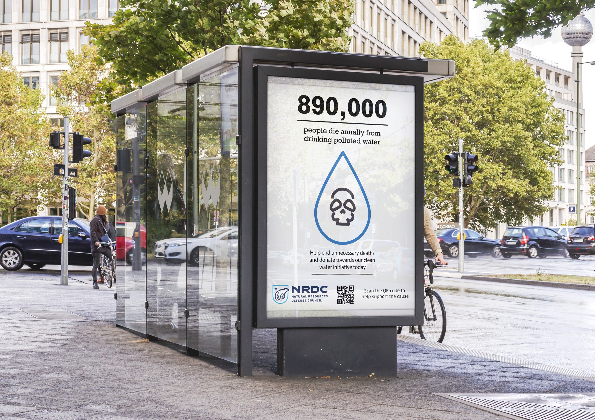
The Natural Resources Defense Council requested a series of posters to help bring awareness to the shocking statistics related to water contaminants.
Client
Client
Client
NRDC
NRDC
NRDC
Discipline
Discipline
Discipline
Infographic Design
Infographic Design
Infographic Design
Deliverables
Deliverables
Deliverables
3 Poster Series
3 Poster Series
3 Poster Series
Software
Software
Software
The Goal
The Goal
The Goal
My goal when creating this poster series was to create a visual representation of statistics and to help grab attention and educate at a glance. The idea behind this series was to draw attention to water-related issues, encouraging people to be more conscious about the water they may be consuming.
Target Markets
Target Markets
Target Markets
Primary Market (70%): Areas with known water contamination. Areas such as Flint, Michigan and Newark, New Jersey would be areas that these posters should be placed. It shows people to be more conscious to the issue and promote encouragement to fight for safer drinking water.
Secondary Market (30%): Public spaces. Spaces such as bus stops, community centers, and grocery stores would make a great place for these posters. All these places have high foot traffic so many people would be able to see them and become aware to the issues.
Designing
Designing
Color
Color
I went for a simpler graphic approach because I wanted to maintain focus on the number. I also chose to use only blue as a color to avoid too much visual distraction while ensuring it contrasts against the rest of the poster.
#3473BA
#333333
#FFFFFF
Typography
Typography
For typography, I chose a combination of a slab serif and a sans-serif font: Rockwell and PT Sans Caption, respectively. These two fonts complement each other and ensure legibility, even at small sizes.
Rockwell Regular
Rockwell Bold
PT Sans Regular
PT Sans Medium
Designing
Color
I went for a simpler graphic approach because I wanted to maintain focus on the number. I also chose to use only blue as a color to avoid too much visual distraction while ensuring it contrasts against the rest of the poster.
#3473BA
#333333
#FFFFFF
Typography
For typography, I chose a combination of a slab serif and a sans-serif font: Rockwell and PT Sans Caption, respectively. These two fonts complement each other and ensure legibility, even at small sizes.