Electric Semi Truck
Case Study
Electric Semi Truck Case Study
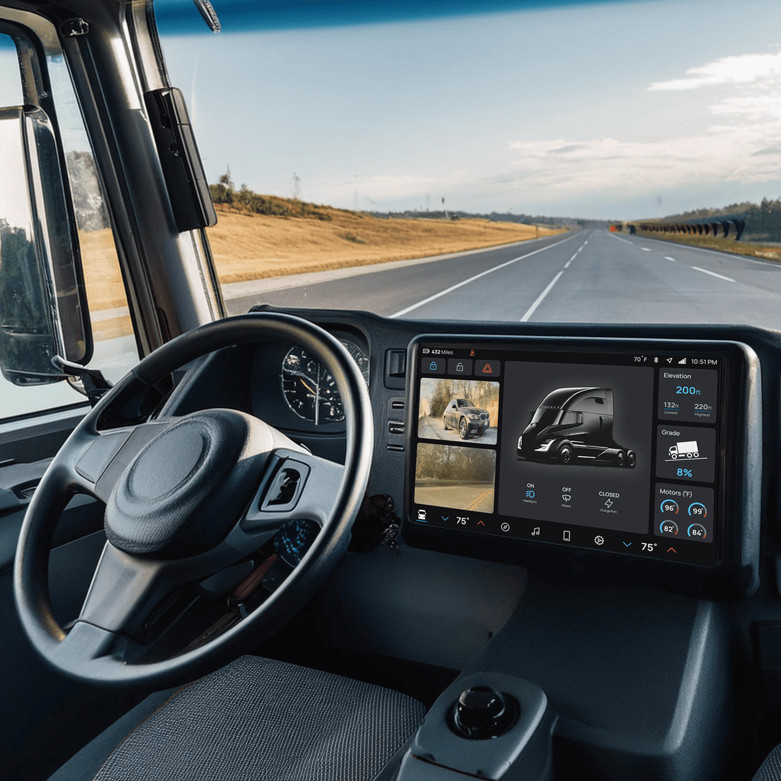
Peterbilt is a motor company known for producing heavy-duty commercial vehicles, including semi-trucks. As some of these vehicles transition to electric power, I recognized the need for an updated interface that reflects this new era. This project presents a concept for a modernized interface tailored to Peterbilt’s next generation of electric vehicles.
Client
Client
Client
Peterbilt
Peterbilt
Peterbilt
Discipline
Discipline
Discipline
UX/UI Design
UX/UI Design
UX/UI Design
Deliverables
Deliverables
Deliverables
Working Prototype
Working Prototype
Working Prototype
Software
Software
Software
The Problem
The Problem
The Problem
The challenge with these new electric semis is the general lack of familiarity among drivers and fleet managers with the unique features and benefits these vehicles offer. This unfamiliarity creates a barrier to adoption, particularly as operators transition from traditional diesel trucks to electric.
The Goal
The Goal
The Goal
The goal is to create a user interface that not only ensures safe deliveries but also enhances the overall driving experience. By focusing on safety, simplicity, and familiarity, I aim to design an interface that drivers enjoy using for extended periods, ultimately contributing to more efficient and enjoyable experiences.
Target Markets
Target Markets
Target Markets
Primary Market (75%): My primary market would be the truck drivers or operators of the semi truck. They need a user-friendly, intuitive, and efficient interface that enhances their driving experience and allows for a smooth transition to the new interface. Features like real-time route navigation, vehicle diagnostics, and easy access to communication are crucial for their safety and productivity.
Secondary Market (15%): Fleet managers are responsible for overseeing the operations of large fleets, fleet managers prioritize safety, efficiency, and cost-effectiveness. They would be interested in features such as real-time tracking, vehicle optimization, maintenance alerts, and performance analytics to ensure the fleet runs smoothly and efficiently.
Tertiary Market (10%): Peterbilt, the manufacturer, has a invested interest in ensuring that their vehicles are equipped with the latest and most efficient technology. This includes ensuring the UI is user-friendly, reliable, and aligns with the brand’s reputation for quality and innovation.
Primary Market (45%):
Working-upper class individuals and couples. This demographic is willing to pay a premium for the quality and and convenience. These customers also have busy lifestyles and are likely to frequent delivery services.
Secondary Market (45%):
Young professionals and food enthusiasts who enjoy new food experiences, but might not be able to go out due to time constraints. These customers value the convenience of delivery the most, while enjoying the comfortability of there own homes.
Tertiary Market (10%):
Family's that want to enjoy a high quality meal, but don't want to deal with the hassle of bringing the children out to a restaurant.
Primary Market (75%): My primary market would be the truck drivers or operators of the semi truck. They need a user-friendly, intuitive, and efficient interface that enhances their driving experience and allows for a smooth transition to the new interface. Features like real-time route navigation, vehicle diagnostics, and easy access to communication are crucial for their safety and productivity.
Secondary Market (15%): Fleet managers are responsible for overseeing the operations of large fleets, fleet managers prioritize safety, efficiency, and cost-effectiveness. They would be interested in features such as real-time tracking, vehicle optimization, maintenance alerts, and performance analytics to ensure the fleet runs smoothly and efficiently.
Tertiary Market (10%): Peterbilt, the manufacturer, has a invested interest in ensuring that their vehicles are equipped with the latest and most efficient technology. This includes ensuring the UI is user-friendly, reliable, and aligns with the brand’s reputation for quality and innovation.
User Interviews
User Interviews
I conducted many user interviews across my target markets to gain deeper insights into what users truly needed and desired from the interface. These findings played a critical role in shaping the design to meet users’ needs and expectations. Conducting these interviews before starting the design process was essential, as it provides clear foundation for my work and helps prevent possible issues from arriving later in the design phase.
Conclusions from User Interviews
Trouble finding where to connect a phone
Pointed out statistics that they often check
Some icons needed changing for clarity
Needed quick actions on home screen quickly accessible
Trouble finding where to connect a phone
Pointed out statistics that they often check
Some icons needed changing for clarity
Needed quick actions on home screen quickly accessible
User Interviews
I conducted many user interviews across my target markets to gain deeper insights into what users truly needed and desired from the interface. These findings played a critical role in shaping the design to meet users’ needs and expectations. Conducting these interviews before starting the design process was essential, as it provides clear foundation for my work and helps prevent possible issues from arriving later in the design phase.
Conclusions from User Interviews
Trouble finding where to connect a phone
Pointed out statistics that they often check
Some icons needed changing for clarity
Needed quick actions on home screen quickly accessible
Personas
Personas
After collecting some data from research, I created two different personas that each represent the primary user groups that this interface is designed for. These user personas helped further my understanding of the people I am designing for and the problem I am aiming to solve with this interface.
Competitive Analysis
To get a better understanding of the competition in this industry, I conducted a competitive audit of two companies. From this audit, I identified essential features and potential challenges that could impact the design. By performing this audit I am able to design my app to not only meet their levels of functionality but surpass them.
Information Architecture
This map is shows the apps structure and the hierarchy of pages and how the interact with each other.
Low Fidelity Wireframes
These are low-fidelity wireframes that I used during the early stages of user testing. Conducting these tests early in the design process is crucial, as it saves time, energy, and resources later on. During testing, I asked the testers to state their thoughts out loud so that I could get a deeper insight of their thoughts and understand how they may have gotten lost or confused by a task. This early testing helped me discover issues with my design and helped me make adjustments that will overall improve the user experience.
Low Fidelity Findings
Users were confused by some iconography used
Some links between pages were directed incorrectly
Users felt overwhelmed and cluttered on some pages
Users were confused by some iconography used
Some links between pages were directed incorrectly
Users felt overwhelmed and cluttered on some pages
Users were confused by some iconography used
Some links between pages were directed incorrectly
Users felt overwhelmed and cluttered on some pages
UI Design
UI Design
Color
Color
In designing the color palette for the electric semi interface, I aimed to create a visually engaging yet functional experience. The dark background provides a solid foundation that minimizes glare and enhances visibility while the bright blue as the primary color introduces a modern touch, symbolizing innovation and forward-thinking technology that aligns with the electric vehicles. Then as for Complementary colors like the cold blue and the energy green ensure important information is easily glanceable. The inclusion of neutral tones for text and inactive elements maintains legibility and reduces visual strain, which is essential for driver safety and comfort. The use of contrasting colors like hot red for cancel actions reinforces clarity in urgent situations. Overall, this palette was carefully picked to enhance the user experience, ensuring it resonates with the professional needs and safety priorities of the semi-truck market.
#111113
Background
#111113
Background
#56C3FD
Primary
#56C3FD
Primary
#303136
Tabs
#303136
Tabs
#EEEEF0
Text
#EEEEF0
Text
#B2B3BD
Inactive
#B2B3BD
Inactive
#00D8FF
Borders/Separators
#00D8FF
Borders/Separators
#38E35D
Energy
#38E35D
Energy
#F95050
Cancel/Heat
#F95050
Cancel/Heat
#566FFD
Cold
#566FFD
Cold
Typography
Typography
I chose the font Manrope, designed by Mikhail Sharanda, for this project. Manrope is a modern sans-serif font with a unique geometric design style. I selected it for its visual appeal and excellent legibility on screens. In car UI design, font legibility is crucial because text must be easily glanceable and readable, allowing users to quickly absorb information and return their focus to the road. Manrope’s slightly taller x-height enhances readability across all screen sizes. Additionally, its unique visual style contributes to a cohesive overall design, integrating both textual and visual elements seamlessly.
Manrope Regular
Manrope Medium
Manrope Bold
Manrope Extra Bold
UI Design
Color
In designing the color palette for the electric semi interface, I aimed to create a visually engaging yet functional experience. The dark background provides a solid foundation that minimizes glare and enhances visibility while the bright blue as the primary color introduces a modern touch, symbolizing innovation and forward-thinking technology that aligns with the electric vehicles. Then as for Complementary colors like the cold blue and the energy green ensure important information is easily glanceable. The inclusion of neutral tones for text and inactive elements maintains legibility and reduces visual strain, which is essential for driver safety and comfort. The use of contrasting colors like hot red for cancel actions reinforces clarity in urgent situations. Overall, this palette was carefully picked to enhance the user experience, ensuring it resonates with the professional needs and safety priorities of the semi-truck market.
#111113
Background
#56C3FD
Primary
#303136
Tabs
#EEEEF0
Text
#B2B3BD
Inactive
#00D8FF
Borders/Separators
#38E35D
Energy
#F95050
Cancel/Heat
#566FFD
Cold
Typography
I chose the font Manrope, designed by Mikhail Sharanda, for this project. Manrope is a modern sans-serif font with a unique geometric design style. I selected it for its visual appeal and excellent legibility on screens. In car UI design, font legibility is crucial because text must be easily glanceable and readable, allowing users to quickly absorb information and return their focus to the road. Manrope’s slightly taller x-height enhances readability across all screen sizes. Additionally, its unique visual style contributes to a cohesive overall design, integrating both textual and visual elements seamlessly.
Manrope Regular
Manrope Medium
Manrope Bold
Manrope Extra Bold
High Fidelity User Testing
Once I had a solid design for my high-fidelity mockup, I conducted another round of user testing to solidify my design choices and identify any remaining imperfections. I built my high-fidelity prototype to be as functional as possible, incorporating not just the actions being tested, but also other interactive elements. I’ve found that having a more fully developed and functional prototype provides deeper insights into user's behavior and allows for more thorough exploration of the interface.
For these testing rounds, I used both moderated and unmoderated user testing methods. I conducted two moderated sessions and two unmoderated sessions. By using both approaches, I was able to gather more comprehensive feedback on what aspects of the interface were effective and which areas still needed improvement.
High Fidelity Findings
Users completed all tasks with ease
Was told UI felt cohesive and belonging together
Appreciated the ability to multitask apps on the homescreen
Some icons could take the place of some text making the UI more glanceable and safe
Light mode of the UI needed to be created
Users completed all tasks with ease
Was told UI felt cohesive and belonging together
Appreciated the ability to multitask apps on the homescreen
Some icons could take the place of some text making the UI more glanceable and safe
Light mode of the UI needed to be created
Users completed all tasks with ease
Was told UI felt cohesive and belonging together
Appreciated the ability to multitask apps on the homescreen
Some icons could take the place of some text making the UI more glanceable and safe
Light mode of the UI needed to be created
Stats & Analytics
Stats & Analytics
Stats & Analytics
During the high-fidelity usability study, the interface achieved a 100% task completion rate for all tasks, demonstrating its intuitive design and ease of use. The average time on task was approximately 6 seconds, with users sustaining focus for longer periods rather than brief 2-second glances. This time is significantly below the National Highway Traffic Safety Administration’s (NHTSA) recommended maximum of 12 seconds for combined glances, ensuring a safe and efficient interaction. Furthermore, in A/B testing, all participants preferred this interface over the current systems drivers use, highlighting the design’s effectiveness in unifying multiple functions into one cohesive system for improved interaction.