Project Overview
I designed a website for Copper Summit Ski Resort that reflects the luxurious and high-end nature of their brand. Balancing modernity with sophistication, I crafted a sleek, user-friendly interface using a refined black-and-white color palette with warm orange accents to highlight calls to action. The goal was to elevate the resort’s online presence to match its esteemed reputation, creating a visually stunning experience that embodies their commitment to quality and excellence.
UX Research
Primary Market
Working-upper class individuals, couples, and friends. This demographic is willing to pay a premium for the quality and experiences offered
Secondary Market
Family's on a family vacation. This demographic is sometimes willing to spend the money and travel to a high end ski resort like Copper Summit to enjoy a luxurious vacation.
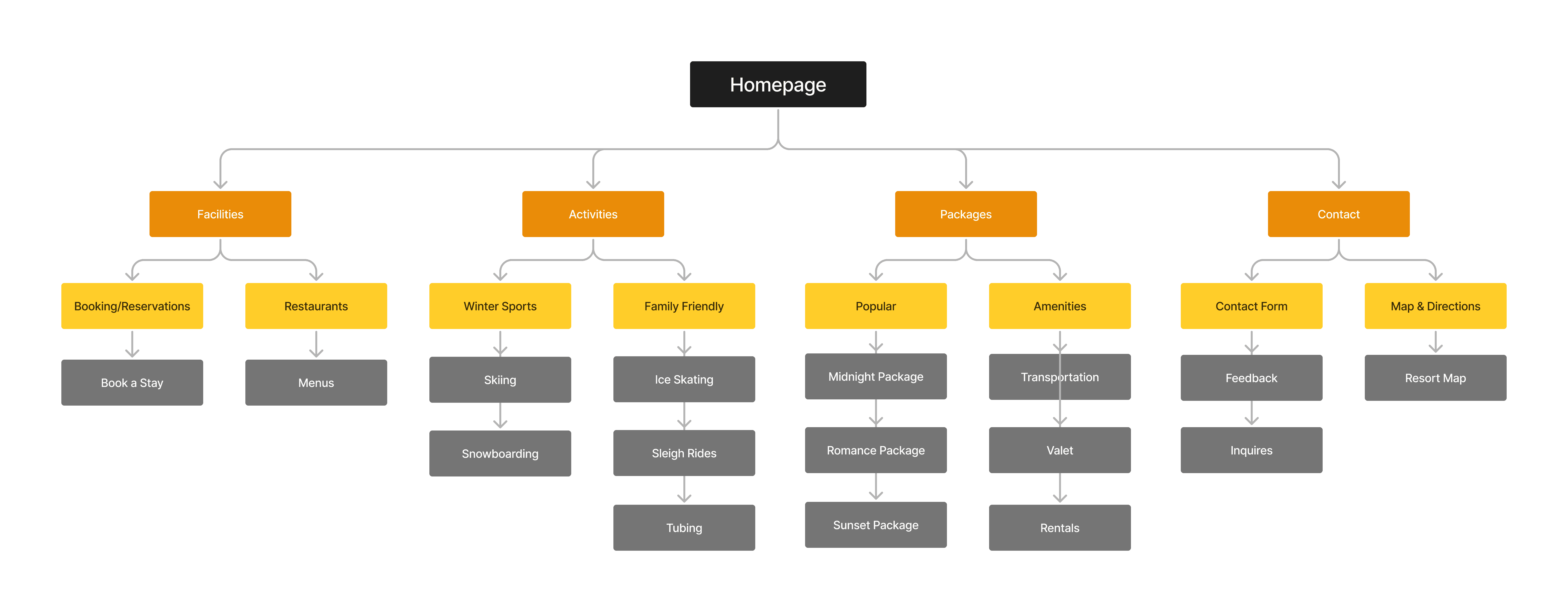
This map is shows the sites structure and the hierarchy of pages and how the interact with each other. These maps are essential in creating a blueprint of the sites structure not only for the designers, but for the stakeholders as well.

User Testing
These wireframes played a vital role in the design process by providing me with a early visual blueprint for the website. They allow for better team communication and ensure that stakeholders are aligned on the vision for the project. They also help avoid any major changes later down in the design process.

Coding
For the programming of the website, I utilized HTML5, CSS, and JavaScript, coding entirely from scratch within Visual Studio Code. This approach allowed me to have full control over the design and functionality, ensuring that every aspect of the website met my high standards for quality and performance. The coding process included creating a fully responsive design that adapts to various screen sizes.
In addition to the responsive design, I implemented CSS techniques for animations and transitions making the site more engaging. JavaScript was used to add interactive elements like dynamic content updates and smooth scrolling effects, which contribute to a more enjoyable experience.
A significant focus of the project was search engine optimization (SEO). I implemented the best SEO practices, including meta tags, alt attributes for images, and structured data, to ensure that all pages are easily found through all search engines. Creating strong SEO is crucial for natural website discovery, and this project showcases my ability to optimize a site for better visibility and higher search engine rankings.
Final Design

Final Thoughts
In conclusion, the Gold Stag Pub app solves the need for a quick, easy, and intuitive ordering experience. Through thorough research and user-centered design, I addressed the users needs and preferences, creating an app that enhances customer satisfaction. This project is another example of my dedication to crafting functional, aesthetically pleasing experiences tailored to users’ needs.


